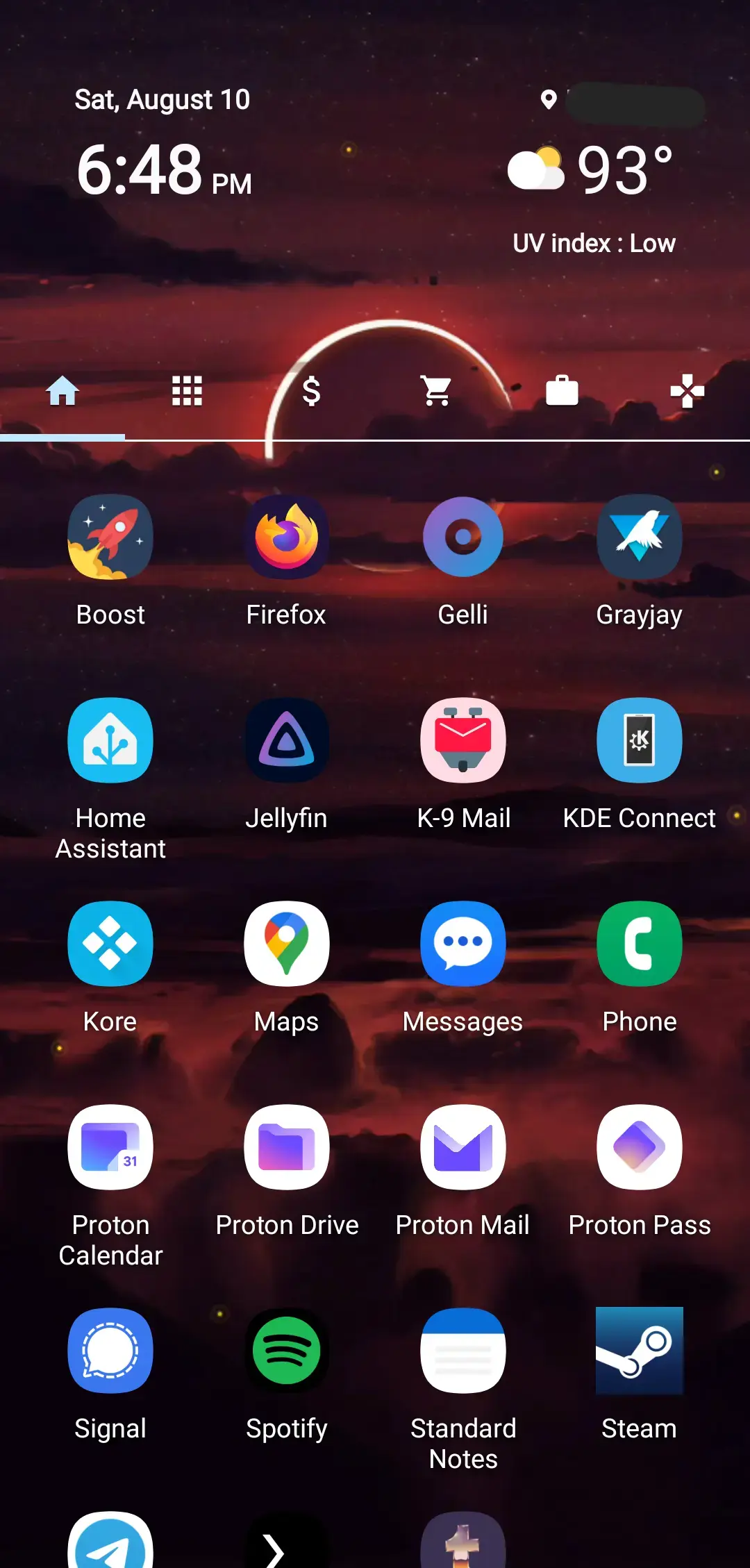
So, anybody know a good launcher to use once Nova goes offline?
PSA: Nova Launcher’s owning company sells their user data. It was a good launcher when it first came out, but it’s been nothing but a downward spiral from there.
Edit for clarity: I don’t mean the app itself. It is owned by an entity that exists to sell consumer data.
I’ve been using Nova for ages, probably back from the KitKat days on a Samsung phone running Touchwiz, i.e. when everything from the vendor side was crap.
I just switched back to my Moto G5’s stock launcher. Honestly, it already does everything I did with Nova. It supports theming, adaptive icons, you can configure the density of its grid, etc. So I uninstalled Nova. Fuck it.
Realistically I think most stock launchers are probably perfectly adequate for everything normal users want to do these days.
I used to use Total launcher to make the most convoluted home screen possible that literally nobody but me knew how to use. Like several circles you swiped on in different directions to open folders, absolutely no labels, etc. Now I just use the stock pixel one lol
I miss swiping on icons. I used it for opening folders. Like Firefox would have all my most used browsers like Chromium Firefox Focus, and Firefox Nightly. My Messages app would have all my messaging apps. Camera had Photos, and photo editing apps. I barely had to go to the drawer.
Likewise. I use Total, and I have 12 folders on my homescreen, each of which can be swiped up, down, left or right to open specific apps or run specific actions. So, 48 options without ever leaving the home screen :-)
I very rarely have to even open a folder, let alone the app drawer (in fact Total doesn’t really even seem to have a built in app drawer, although it exists somewhere in the background)
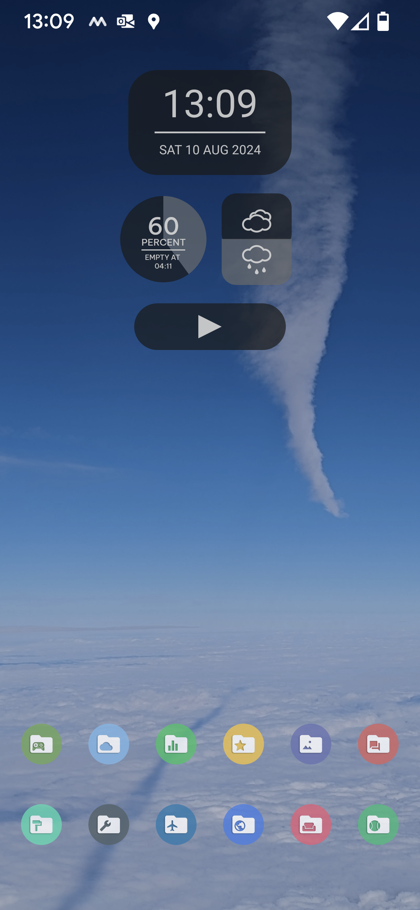
I had the same experience when I recently had to get a new phone. Stock launchers have improved a lot.
But, but, they assured us that that wasn’t going to happen? You mean they lied??
JFC, what a fall from grace for Nova. Sad to see.
I’m opted out of that in my settings, it’d be quite the scandal if they were ignoring GDPR?
I’ve amended my comment to make it more clear. I didn’t mean to imply the app sends your data to third parties, only that the company who owns it profits off of third party information brokering. Where that information comes from is beside the point in my opinion.
deleted by creator
Use an Open Source launcher, here my recommandations :
-
Lawnchair, basic launcher to replace stock launcher
-
Kvaesito, search based browser and a lot of customization
-
Mlauncher, fork of Olauncher, minimalistic and text based
I’ve been using Kvaesito lately and I absolutely love it.
It’s search based, meaning you can have an extremely minimal appearence while having lots of customization options and extremely quick access to apps (and app features, most importantly).
I strongly recommend using it if you like efficiency
Don’t forget KISS launcher. It’s excellent, albeit a little rough around the edges.
It’s not my favorite and I think kvaesito can replace it
-
I’ve been working on a launcher for a while now, do help me test it out!
Features include:
- Widget stacks (with auto scroll)
- Swipe up and swipe down to launch different apps
- Display app drawer icons as tiles or a list
- Individually resize home screen icons, for mixed-size icon layouts
- Freely position and resize a widget or icon
- Frosted glass background for widgets (experimental)
- App drawer folders
- Fade a widget
- Separate layouts for different screens for foldables
- Tap a folder to launch its first app (swipe to open folder)
- Assign a nickname to an app for instant app search and launch (e.g. searching “ff” launches Firefox instantly)
- Lots of custom animations and haptics
Planned features include:
- Profile switching with Tasker support
- Square tiles for app drawer
- Swipe to open a widget pop up
Not open source, a little disappointed. I’ll give it a try when it is
Can you group the app drawer by letter so that I can immediately jump to ‘S’ to launch Sync for Lemmy? It’s pretty much the entire reason I can’t move away from Microsoft Launcher. I feel this is an essential feature, and I’ve tried basically every launcher I can find.
Do you mean the A-Z bar on the right of the drawer in Microsoft Launcher?
I used Nova for years. When they got bought out I switched to a bunch of different launchers. My favorite turned out to be Kvaesitso.
It was weird for me at first because having apps on the main screen was something I’ve grown acustomed to. You can have a row if you want though. There is an option. After using it for a few weeks, I realized their layout works best for me.
Let me know if there are other launchers you recommend. I appreciate it.
I tried to like Kvaezitso, and I loved some of the features, but it’s too strict in others that I didn’t like. I want Lawnchair and Kvaezitso to make love and have a perfect baby.
After getting a replacement phone, I had to redo everything. I decided to check out some new options. I have nova prime and have loved it.
I am now using Niagara Launcher. It’s different. Very different. The team recommends using the app for at least a week to give it a true test run. I did have my doubts because it’s so different but dang do I love it. I haven’t switched back and I don’t mean this to throw shade on nova. Nova is great, but I like this better.
Instead of thinking of ways to change the launcher, they created a whole new launcher as if they didn’t take into consideration the current way we do things.
Give it a shot.
https://play.google.com/store/apps/details?id=bitpit.launcher
I second that! Been using it for ~4 years now and I so much prefer it to the old launchers. After installing it I completely stopped testing new launchers.
Does anyone still remember the old (2010) launcher called slide it. Unfortunatly it was discontinued and I have always been searching for an adequate replacement. In Niagara I have found it.
Anyway, back to why i like Niagara so much. With every other launcher the workflow is like this:
- swipe up for menu
- swipe 2-5 pages left or right till you reach your app
- click your app icon
which takes ages and is tedious.
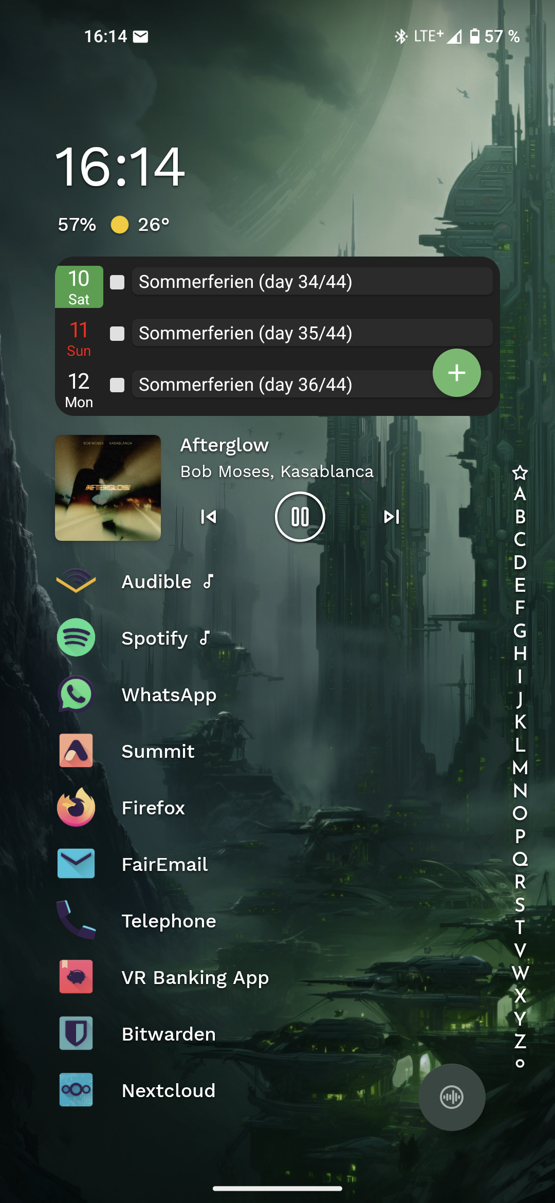
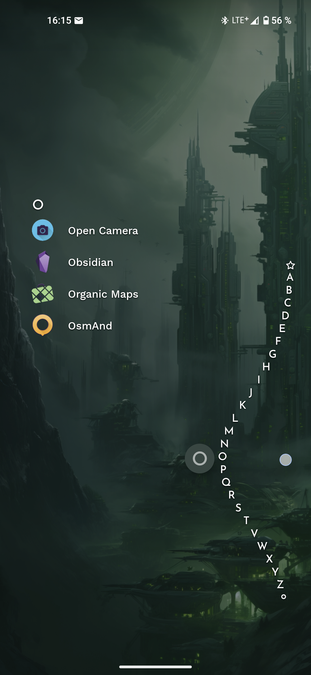
On Niagara I just swipe along the left or right edge until the letter my apps name is starting with appears and click the icon. That’s it.
Having notifications beneath your favorite apps and an included media control app when audio is playing is superb. (I’m using the pro version). Calendar is aCalendar btw.
Best few bucks I have ever spend for some android app.
Oh man I wasn’t prepared with the price. I think it’s either like a few bucks per month OR $30 for life. I did the trial for the full version and canceled it so it wouldn’t reoccur. I got to keep my calendar on the home screen but every other premium feature is locked out… I’ve been OK with it.
deleted by creator
There is a free trial. I cancelled right away and let the trial expire. I am still able to utilize a part of the premium features that I wanted in the first place… So I am just leaving it as is.
Wow, thats expensive, wasn’t aware it got that expensive. I bought it for 5 bucks or so a few years ago.
To be honest, I would still pay, if I hadn’t already, it’s that good.
Your wallpaper is gorgeous! Mind sharing the source?
That wallpaper is one of the wallpapers that comes with the Niagara launcher!
I keep hearing about Niagara and everyone says the same thing, it’s different.
Could you describe how it’s different? Just the setup, or is it different when you’re using it?
The whole concept is different. I’ve just started trying it and the gist of it is that it’s basically only the app drawer, but on steroids. There is no home screen to arrange, you simply set favorite apps that show up first. Anything else you select by scrolling through the alphabet, which seems quick enough if you know the app name you’re looking for.
I can already tell that I would love it more if favorites were redesigned a bit to use the initial space better. But this would betray the simplicity they are trying to achieve.
So you can set up some options. I have mine set where I can swipe up or down on left or right side and it pulls up this like… Rocket dock alphabet which you can find your apps. The whole thing, as another user posted, makes it so you don’t need an app drawer or a home screen. The home screen is your favorite apps. You can view messages if you set messages as your favorite app. Same with emails or discord etc.
I switched to Niagara when Nova was bought out. I’ve tried other launchers in the meantime, but once I got used to Niagara I never wanted to go back to a “normal” launcher.
Is that the one with a sub? It better give daily dopamine for yet another sub.
It can either be sub or one-time. The one time is like $30 though which seemed crazy to me but… Idk the creators did work and there’s no ads. I’m using the free version.
It’s a one-time purchase.
edit: It’s a one-time purchase for the “pro” version. I’ve been using the free version for a while and really enjoying it. I’ve been thinking of upgrading more to support the developers than for the added features.
It’s a choice of subscription or one time purchase
My bad then! I just saw options for a trial and a one-time purchase, didn’t realize there was a subscription.
Honestly glad to see the option. I’ll take a one-time purchase any day.
Its insane that custom launchers are even needed. I gave the base Samsung version a try and it wont even let me move the app drawer button, its glued to the bottom right. I’d expect an android to let me customize more than windows. Never understood the big tech companies need for this much control. Some brand manager will have a heartattack if I change an app icon, a basic feature in any version of Windows.
They keep things locked down for the 50% of the population with below average intelligence. It makes things easier to trouble shoot when you can’t move the important stuff. Also that group is usually the loudest complainers when they can’t find something, or something goes wrong.
I lament Nova’s demise, too…
I think the reason that the tech companies won’t allow us to have our devices our own way ( Microsoft was doing this decades ago ), is “religious”/ideological, not practical:
I think they “need” to keep everybody permanently in a headlock, with our heads all twisted, because only if we are all in permanent learned-helplessness, only then can they automatically get away with everything they intend to be getting away with, in our world.
IOW, our autonomy violates their totalitarian religion, see?
It’s the same as how ANY spirituality grates on Dawkins’ blood: he wants it all gutted/butchered/destroyed, & suicides of ones he destroyed are no problem for him, & no alternative ever can have any validity to him.
Totalitarianism, whether traditionally “religious”, or in any other ideology/prejudice/religion, is the same: it HATES violation of its homogenous dominion.
( comically: homophobic-religions want a homogenous het humankind, with no violation of that homogeneity. The existence of homosexuals is too heterogenous for them )
Autonomy is something that totalitarian supremacism ideology “needs” to obliterate from the whole world.
Consistently.
It seems to be a damn-good diagnostic for it, even!
_ /\ _
OnePlus does it pretty well. I just love the ability to have separate actions for swiping an app icon so I use nova
My recommendation is Niagara Launcher. It’s more minimal than other launchers. I like the reduction in clutter.
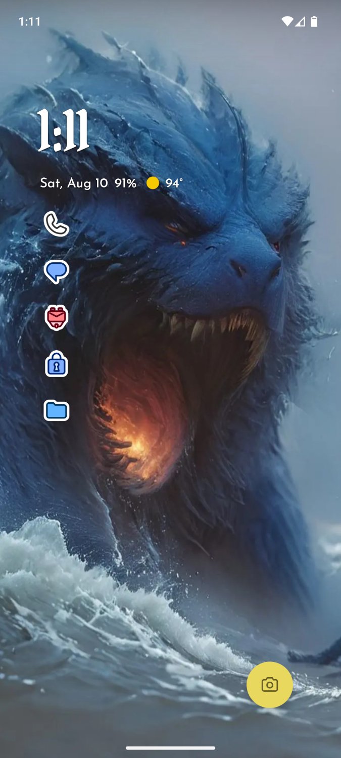
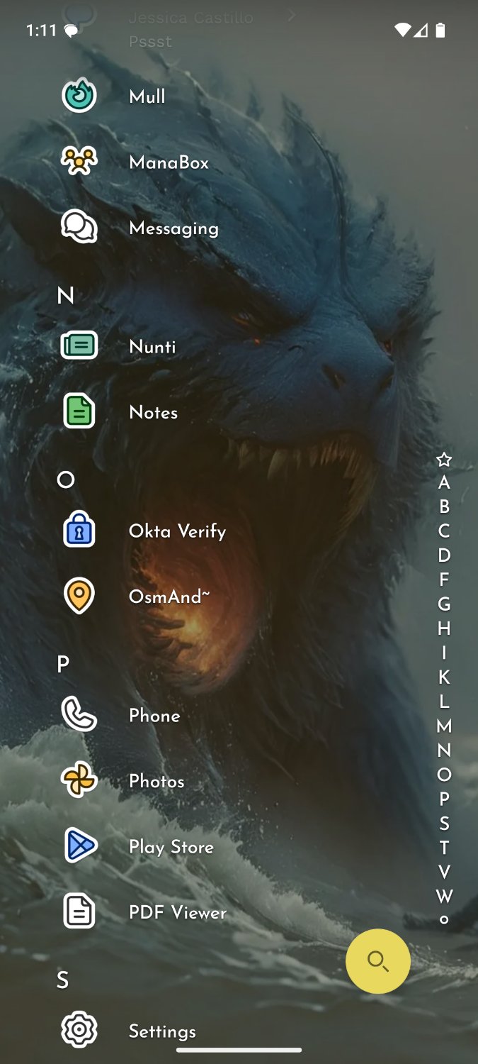
That apps list reminds me of Windows Phone for some reason. Oh, and the mobile version of KDE Plasma too.
deleted by creator
Check out Square launcher. Took the WP design and extended it. Gloriously customizable.
deleted by creator
Same.
I never had a WP, but I do have a few Zunes. The Live Tile main screen for WP is a bit too busy for me, but I would love to have the slightly cut-off styles in settings and menus that it and the Zune models had. Just really vibed with the look for some reason.
Windows phones were really solid, OS was very user friendly and stable. I personally didn’t feel the “app gap” that a lot of others complained about but, I use my phone for browsing, calls & text. If I recall correctly it was also ahead of the curve with PWAs, integrated them really well. And price/performance was good on some models like the Lumia 650.
I’ve been using Niagra for a few months now and love it 👍
Looks nice, whats your icon pack?
I’m using icons from the Anycon pack. It’s the Niagara Launcher’s “collection of icon packs specifically developed for Niagara Launcher”.
Lawnchair
I thought that’s in perceptual pre release.
Idk, it is what it is, I’ve used it ever since Nova got kinda dumb like 5-6 years ago. Put it on every phone. It hides apps, keeps my phone looking clean. It’s excellent.
Yea that’s what i switched to after nova sold out, its alright gets the job done. Fuck Nova
I use Lawnchair as well because I require my launcher to be open source. The only thing is it is not on F-Droid or Playstore so it must be installed and updated manually. I have found it to be stable enough for my purposes.
EDIT: And after making the comment below I just noticed the date on the version is 2022? I’m going need to try out the latest version from their Git.
I use droidify because I like the look of it better. It comes with another repo enabled by default called IzzyOnDroid which has the Alpha versions of lawnchair.
I’ve been using it for years. It’s great.
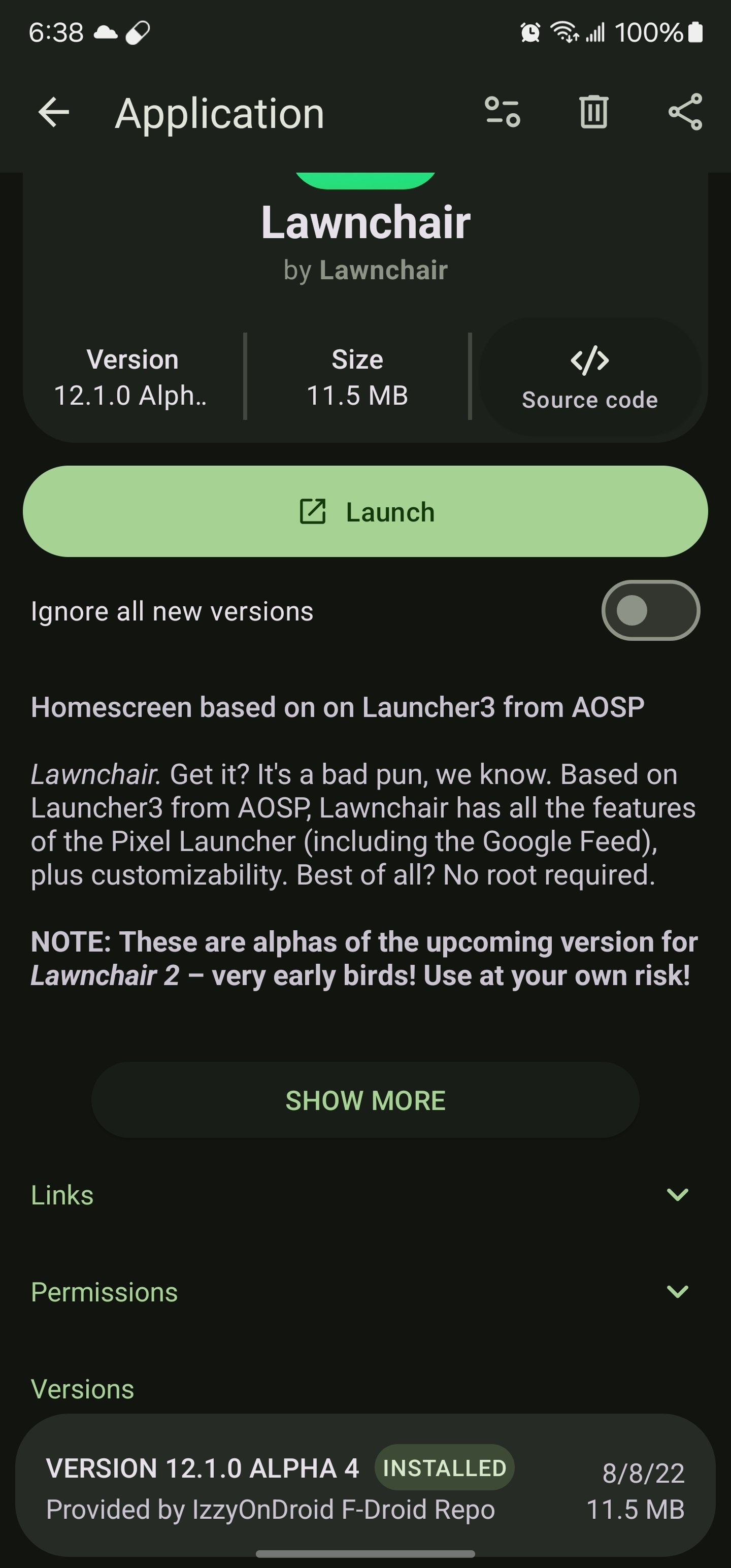
Oh nice, I’ll check out droidify and IzzyOnDroid. To help me remember to update Lawnchair, I added the github release notes atom feed to my RSS reader and turned on notifications so I know every time a new release is ready to install and updating is just a few taps away. https://github.com/LawnchairLauncher/lawnchair/releases.atom
Novalauncher 6.2.19, before they added telemetry
Are there any launchers that have Nova’s 2 best features?
- Swipe-to-open folders (with tap to open the first item in the folder)
- Set any icon you want as an app icon?
I’ve tried Lawnchair and it was missing these 2 features. I will switch to any launcher that supports these!
Action Launcher has this I think.
I’ve been using Neo Launcher for a while as a Nova replacement and it’s pretty good. Both of those features are included as well as things like shortcut actions when you double tap or swipe on the home screen.
Omg thanks for asking this, and thanks to the people that responded. I sincerely went through other alternatives around 5 years ago, and none of them were close to Nova in terms of folder customisation. I’m glad the landscape had changed quite a bit!
For me, it’s the ability to add multiple apps to folders with a checklist.
Total Launcher does both of those. It’s massively customisable, although a bit daunting-looking in places. I love it though.
I switched to Lawnchair a while back (android 14 broke folders in nova for me). It’s not got the same depth of customisation, but ive found it pretty good alternative. And so far seems quick and reliable.
Been using KISS over at F-droid for a few years now after moving on from Nova Launcher. It isn’t for everyone but it isn’t run by goons.
I used KISS for a while and found mlauncher, which is similar in concept, to work better for me. I had to force KISS to restart frequently enough where it became a problem.
Cool, with FOSS I’ll give this a try and if I like it enough, I’ll stick with it and toss a few bines towards the devs. Thanks!
Tried it but it has a few things I don’t like, minor things but the most important is the apps drawer as list
Fair, it has a drawer that’s a list but i realize it is slightly different than expectation.
I’m not used to it, if I need something in the middle/end, I have to scroll to the bottom. I know it has letters but I’m not used to it so I keep forgetting
Yeah takes a little bit to get used to.
I use Olauncher, pretty similar to Niagara and is FOSS. https://github.com/tanujnotes/Olauncher
I recently found this and it works great for my needs
I really like Fast Draw. I wanted the app pages like Nova has, and personally didn’t really need any more than that. This one works like a charm!
https://github.com/peterfajdiga/FastDraw
