- cross-posted to:
- programmerhumor@lemmy.ml
- cross-posted to:
- programmerhumor@lemmy.ml
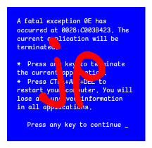
I am not allowed to credit the site that has this disaster. Its owner said “Nobody should see that”
The author should be killed for indentation alone.
I know, right? Needs more tab.
Client: “Can you switch these two colours, you have 1 minute to fix it or you’re fired!”
Result:
my eyes
Well, that’s what you get for using classes like “white” and “lime”.
Exactly this. Bootstrap killed the css star.
color: lime !important; z-index: 1000000;I love the superstitious z-index just in case it does something to help.
At least that’s actually easy and quick to do and is the only way of doing it. Centering a div however has 81639393 ways and it seems the one that works is different every time
Bro its so easy bro, just use flexboxgridcolumns its been a standard since 2010 just flex it bro you haven’t learned to flex yet just check w3c schools and add a flex you can polyfill it but don’t use that hacked one use the good flexpolyfill then { content-align-middle-child-elements: center-middle-true-neutral } so easy with flex bro
Not allowed to credit the site in your text editor?
Is the owner in the room with you now?
the userstyle experience:
Yeah, userstyles are wild. You learn so many ways how to not use CSS. Everything is
!importantand rather than adjusting the HTML to change the structure, you get to do it all in CSS. 🫠
I am very, very surprised about the competence of the commenters here. I have had many discussions on reddit about the advantages of meaningful instead of presentational class-naming and you’re normally met with great resistance, especially with users of frameworks like Bootstrap and Tailwind.
Here, everyone seems to either ‘get it’ or is willing to hear why classes like .lime are bad. Very cool.
People that advocate for presentation naming haven’t endured a major company rebrand.
Worse.

Isn’t cascading styles the whole point of Cascading Style Sheets?
You absolute fool. You must never utter its full name, lest you summon its wrath!
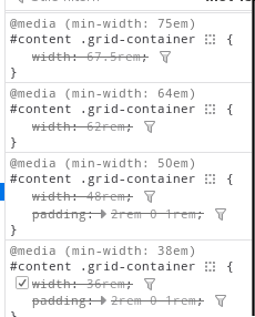
I don’t get it, isn’t this a pretty normal way of using media queries. Granted you’re more likely to see the widths defined in px.
Nowadays we do responsive webdesign instead of micromanaging widths.
This is technically responsive, but I think you have a fair criticism. A single rule like this would be much more maintainable:
#content .grid-container {
	width: 90vw;
	min-width: 12rem;
	max-width: 75rem;
	padding: 2rem 0 1rem;
}
Obviously, media rules have their place, but not for something that’s consistantly a full width container like this seems to be.
Shhh… The poster doesn’t understand CSS and we shouldn’t embarrass them in a community with memes
I hate all webdev beyond using raw HTML, CSS and Javascript to make your own crappy website
no css! js is ok though. though it should be the focus of the page, as in, “observe this cool thing contained within this webpage: a calculator!”
I’m appalled that classes representing visual styles are still a thing. I thought everyone already figured that it was a bad idea back in bootstrap days. But then I recently had an opportunity to work on project that uses Vuetify and saw quite long poems about flexboxes in class names…
“Figured it was a bad idea” actually means that some people were against it because they believed semantic class names were the solution, I was one of them. This was purely ideological, it wasn’t based on practical experience because everyone knew maintaining CSS was a bitch. Heck, starting a new project with the semantic CSS approach was a bitch because if you didn’t spend 2 months planning ahead you’d end up with soup that was turning sour before it ever left the stove.
Bootstrap and the likes were born out of the issues the semantic approach had, and their success and numbers are a testimony to how real the issue was, and I say this as someone who never used and despised bootstrap. Maintaining semantic CSS was hard, starting was hard, the only thing that approach had going for it was this idea that you were using CSS the way it was meant to be used, it had nothing to do with the practicality. Sure, your html becomes prettier to look at, but what good is that when your clean html is just hiding the monstrosity of your CSS file? Your clean html was supposed to be beneficial to the developer experience, but it never succeeded in doing that.


